Teddy Tears
Teddy Tears is a bold ready-to-drink cocktail brand built around expressive flavor, playful storytelling, and a refreshingly unpolished personality. We developed a packaging system for the brand’s lineup of elevated Lemon Drop cocktails, balancing premium spirits and botanical flavor cues with an approachable visual identity designed to feel distinctly different from traditional canned cocktails.
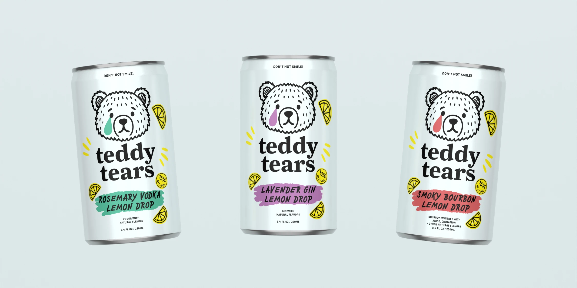
The creative direction embraces imperfection and personality through hand-drawn illustration, unexpected typography, energetic accent graphics, and a restrained color system. Teddy’s expressive bear character anchors the experience while witty messaging like “Don’t Not Smile” and intentionally loose visual details give the brand a memorable, human quality without sacrificing clarity or shelf presence.
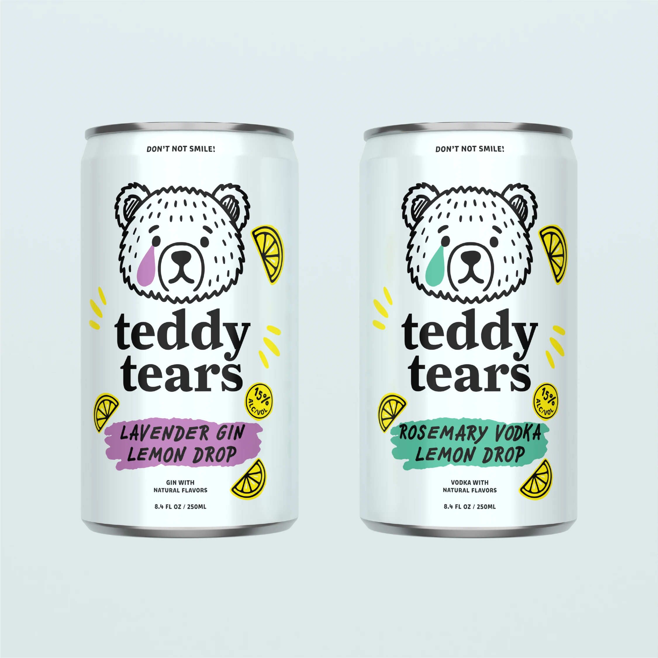
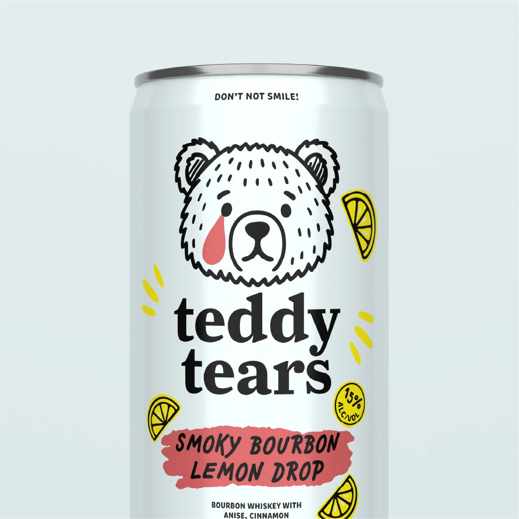
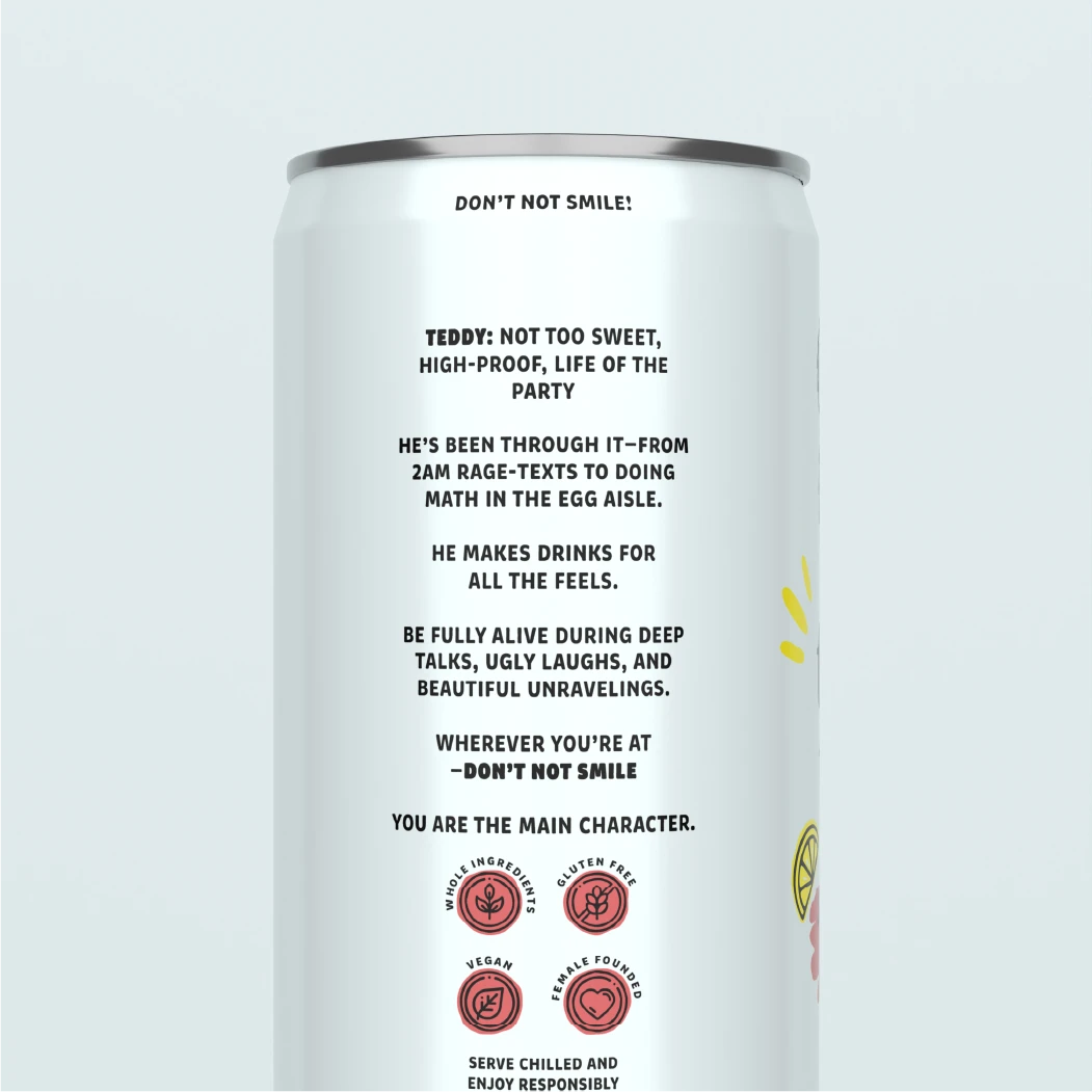
The can system was designed around a clean white foundation that gives Teddy’s black-and-white illustration and oversized typography room to lead. Flavor-specific color accents distinguish Lavender Gin Lemon Drop, Rosemary Vodka Lemon Drop, and Smoky Bourbon Lemon Drop, while hand-rendered lemons, brush-stroke flavor panels, tasting notes, product storytelling, and supporting icons extend the visual language around the full package.
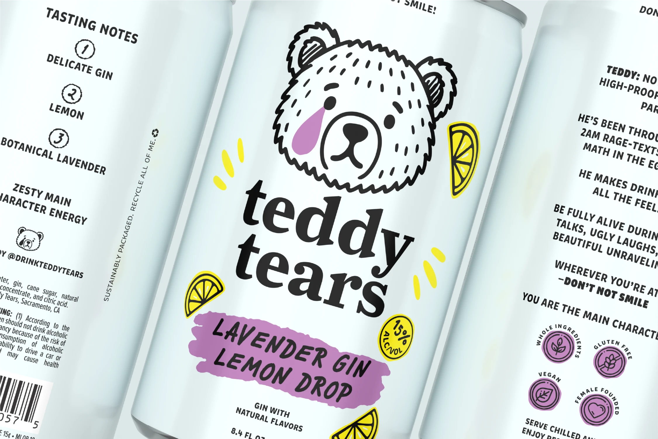
The finished Teddy Tears packaging creates a cohesive family that feels playful, contemporary, and immediately recognizable while giving each cocktail its own personality. The system brings together strong shelf communication, distinctive flavor differentiation, and character-driven storytelling into a flexible foundation that can easily expand as Teddy Tears introduces new flavors and products.