The Busted Cup
The Busted Cup Brewery & Taprooms needed a packaging system that could give each beer its own personality while still feeling unmistakably part of the same brand. We developed a flexible can design system built around bold typography, a consistent branded framework, and custom illustrated scenes inspired by the landscapes, landmarks, and stories surrounding the brewery’s Iowa roots.
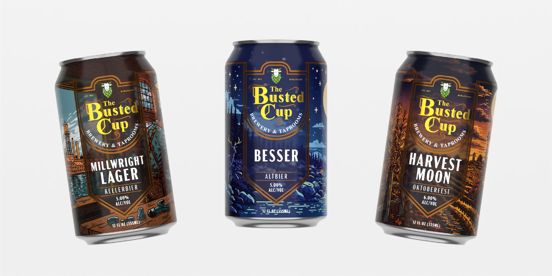
The creative direction balances the familiarity of traditional craft beer branding with a more distinctive, story-driven approach. A structured central label creates a strong and recognizable brand presence across every can, while the surrounding artwork changes dramatically from SKU to SKU—giving each release its own atmosphere, color palette, and sense of place without sacrificing consistency on shelf.
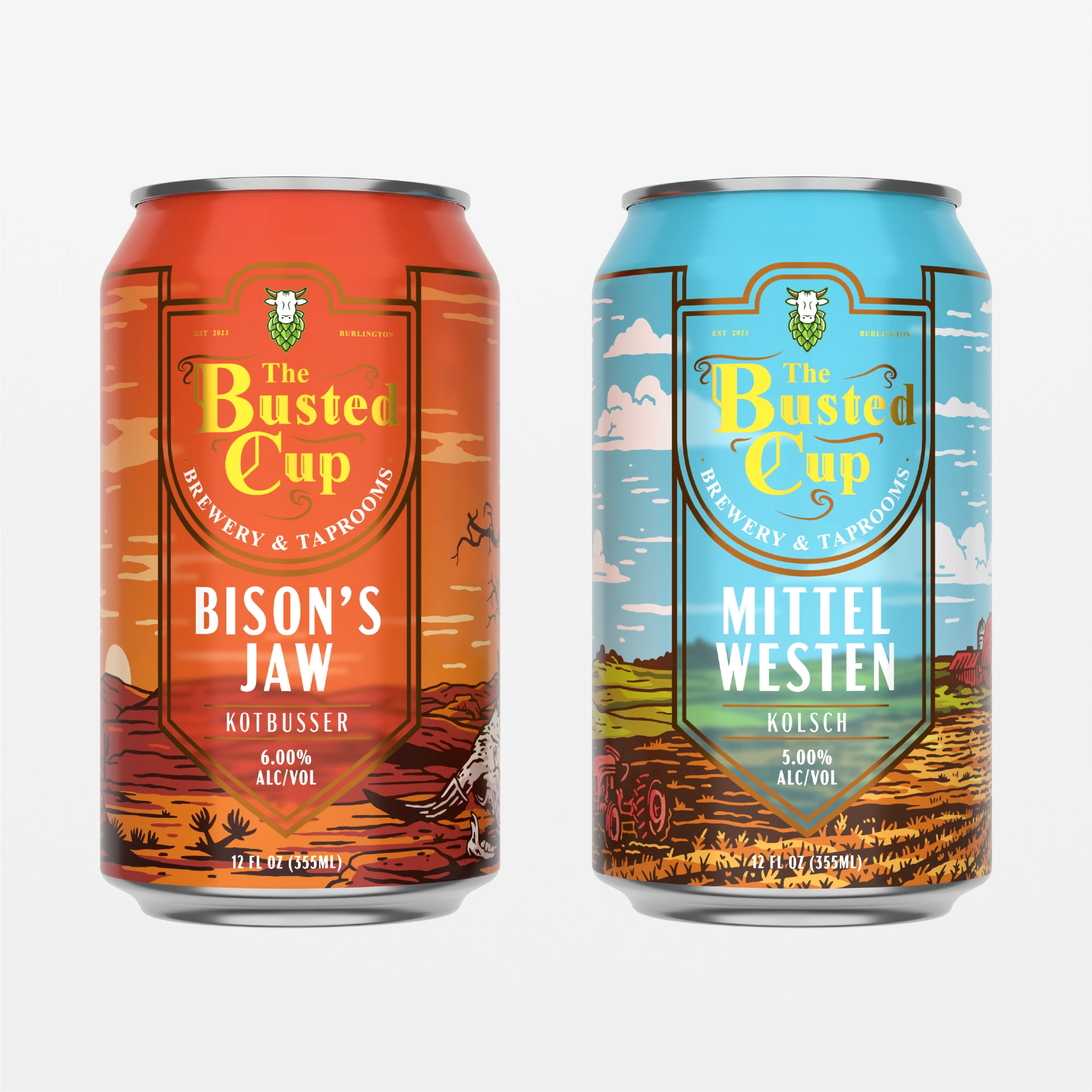
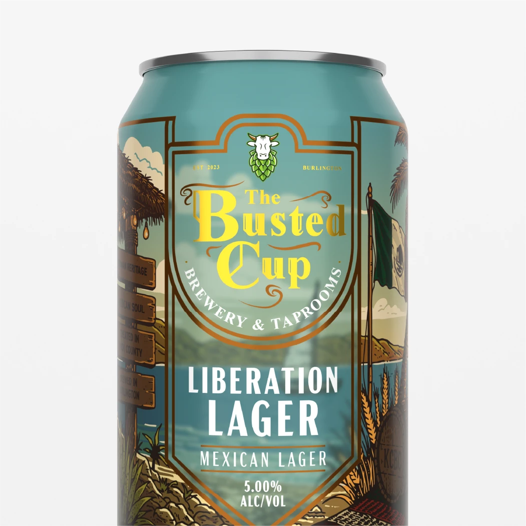
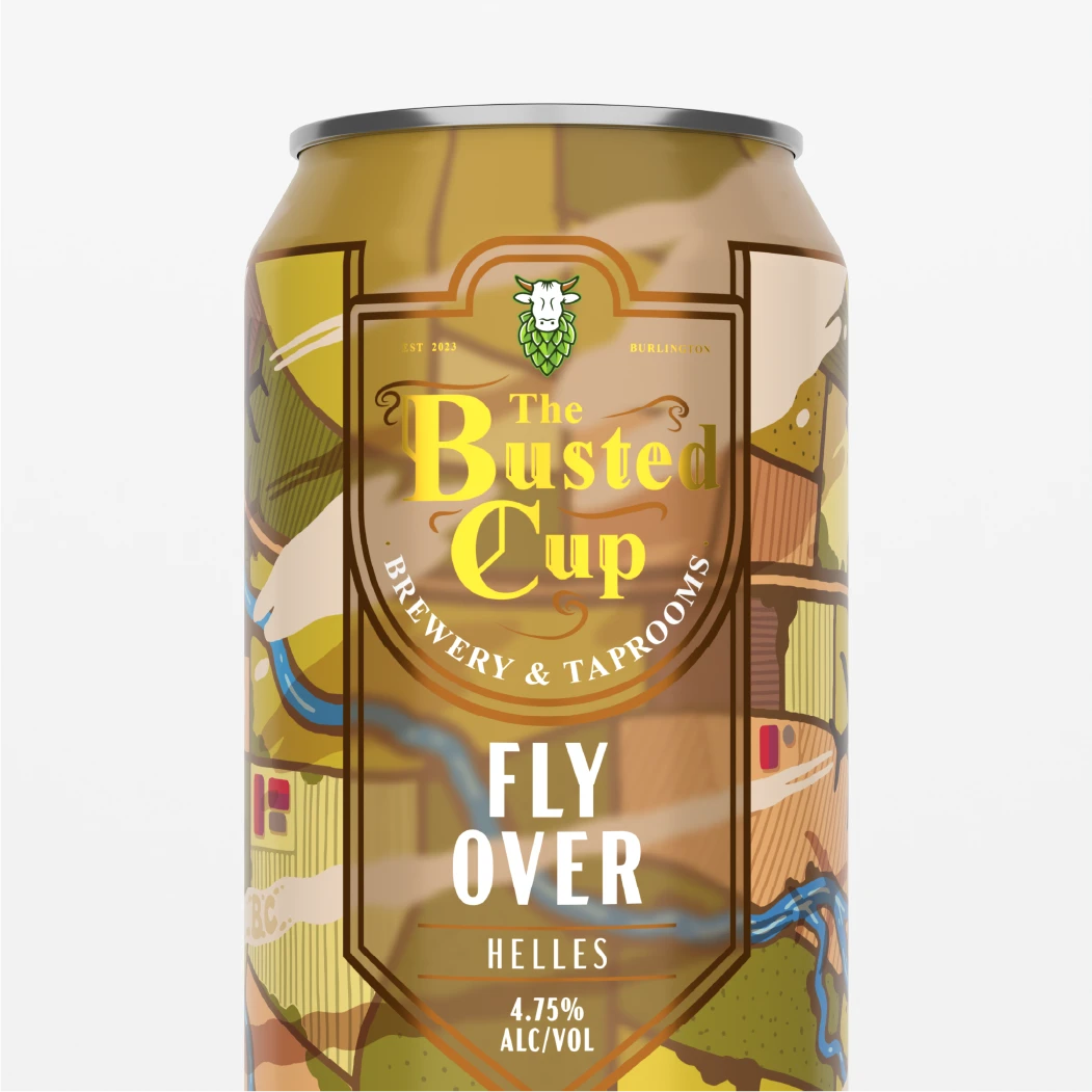
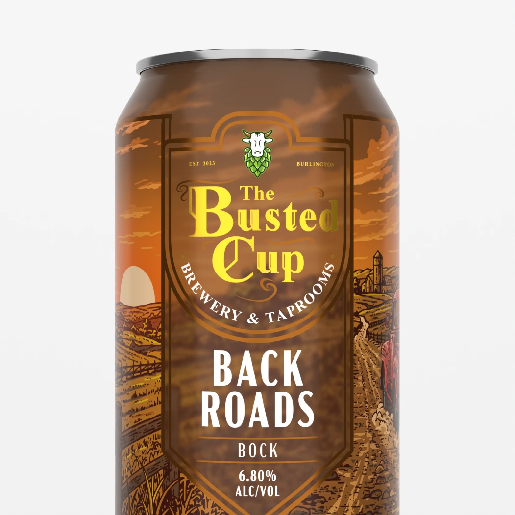
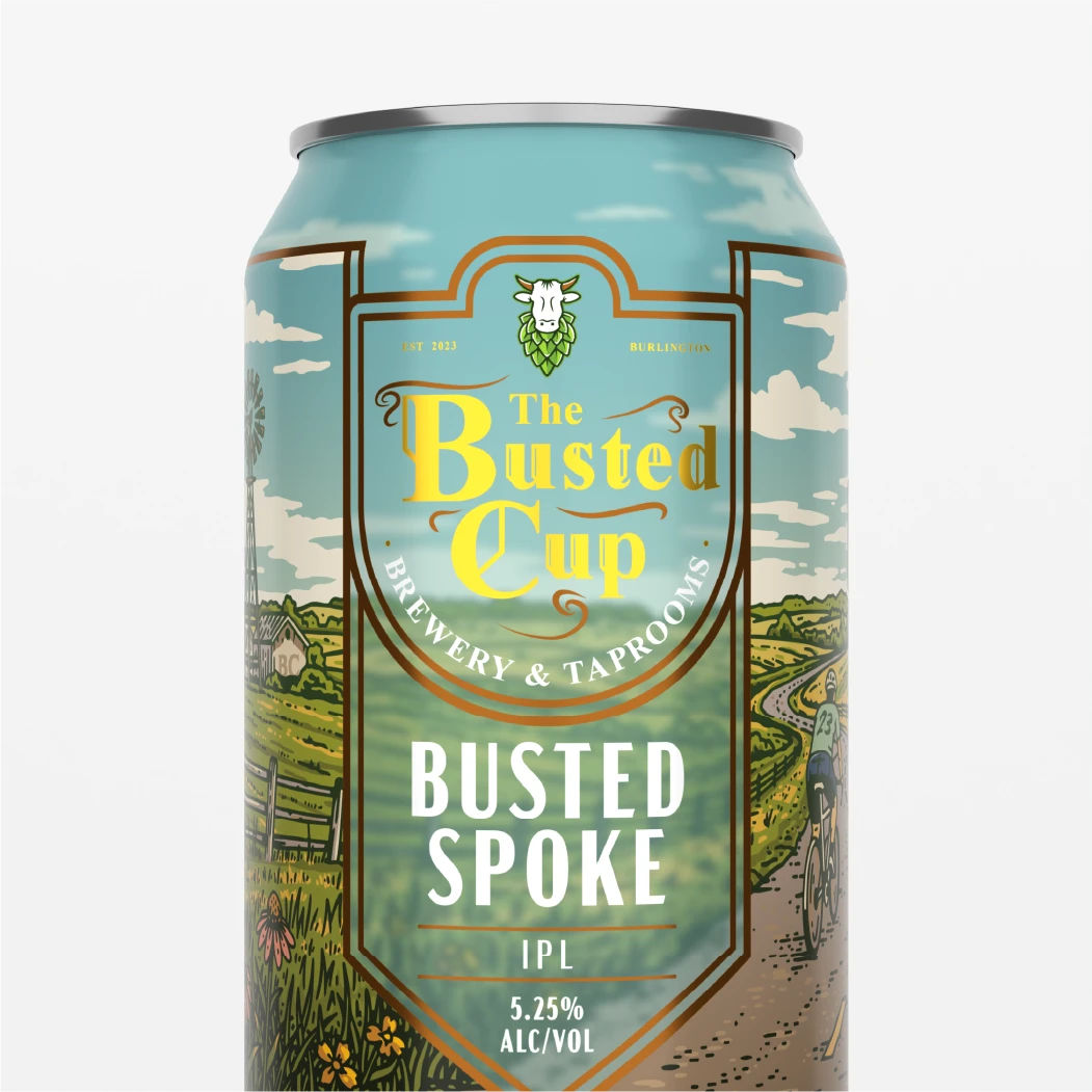
Each can was designed as an individual illustrated world, using custom scenery and carefully controlled color palettes to reflect the personality and story behind the beer. From rural farmland and Midwest backroads to industrial scenes, nighttime landscapes, and seasonal environments, the illustrations wrap around the cans to create depth while the consistent front-panel hierarchy keeps the brewery name, beer name, style, and key product information immediately readable.
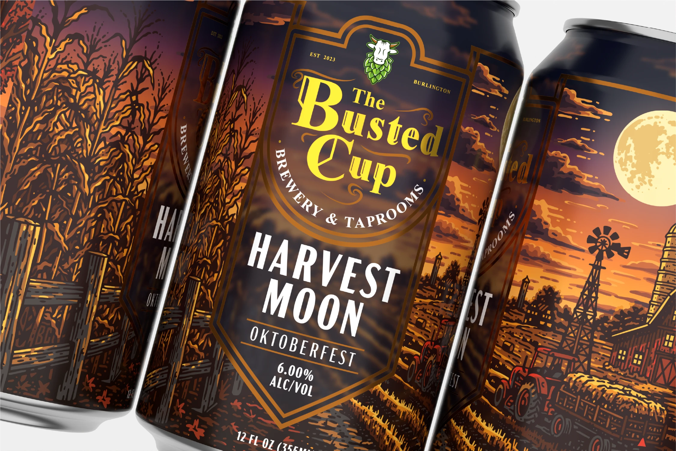
The finished system gives The Busted Cup a scalable foundation for an expanding beer lineup, allowing new releases to introduce completely different stories and illustrated environments while remaining instantly recognizable as part of the same family. Across the collection, consistent architecture and typography create shelf cohesion while the custom artwork gives each SKU the individuality needed to stand on its own—resulting in a packaging lineup that feels crafted, collectible, and uniquely tied to the brewery’s character.