Cortao
Cortao brings the warmth and character of Latin American coffee culture into a ready-to-drink format. We developed an expressive identity spanning branding, illustrated cans, and digital, pairing bold shelf presence with familiar cultural details that make every flavor feel like part of a shared coffee ritual.
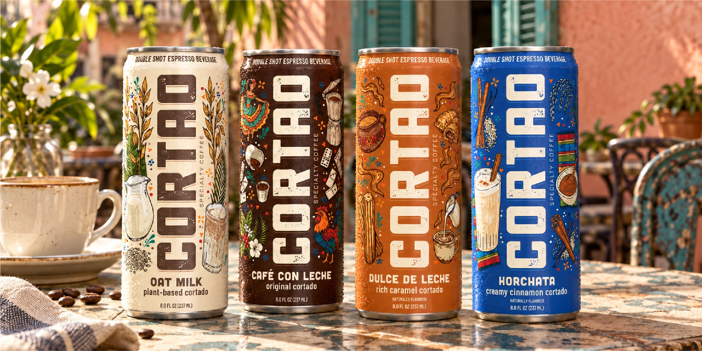
Cortao was built around a simple promise: bold coffee, Latin soul. Inspired by the everyday ritual of cafecito, the brand brings familiar flavors and cultural warmth into a convenient canned format. The identity translates that spirit through expressive illustration, nostalgic textures, and confident typography that feels both rooted in tradition and distinctly contemporary.
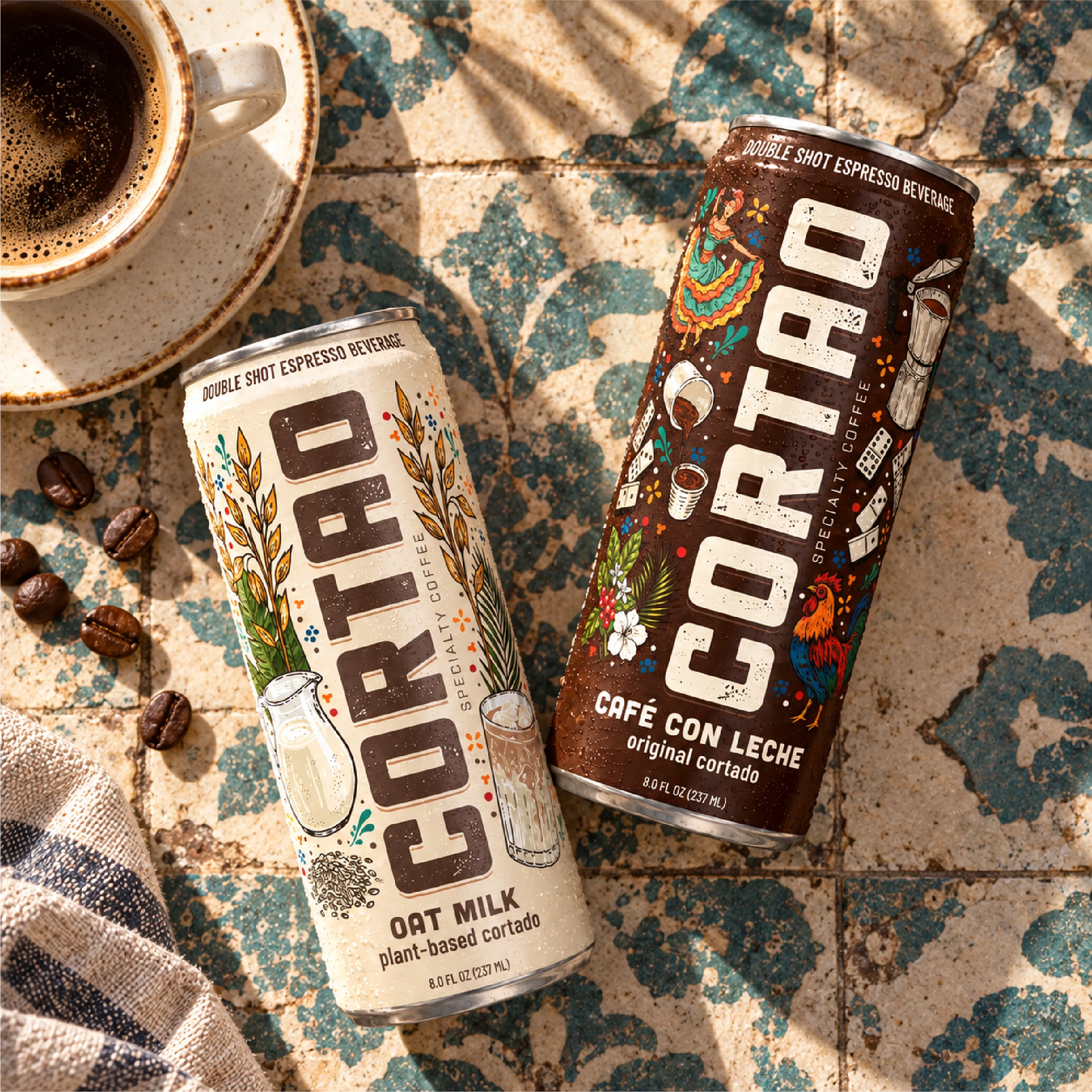
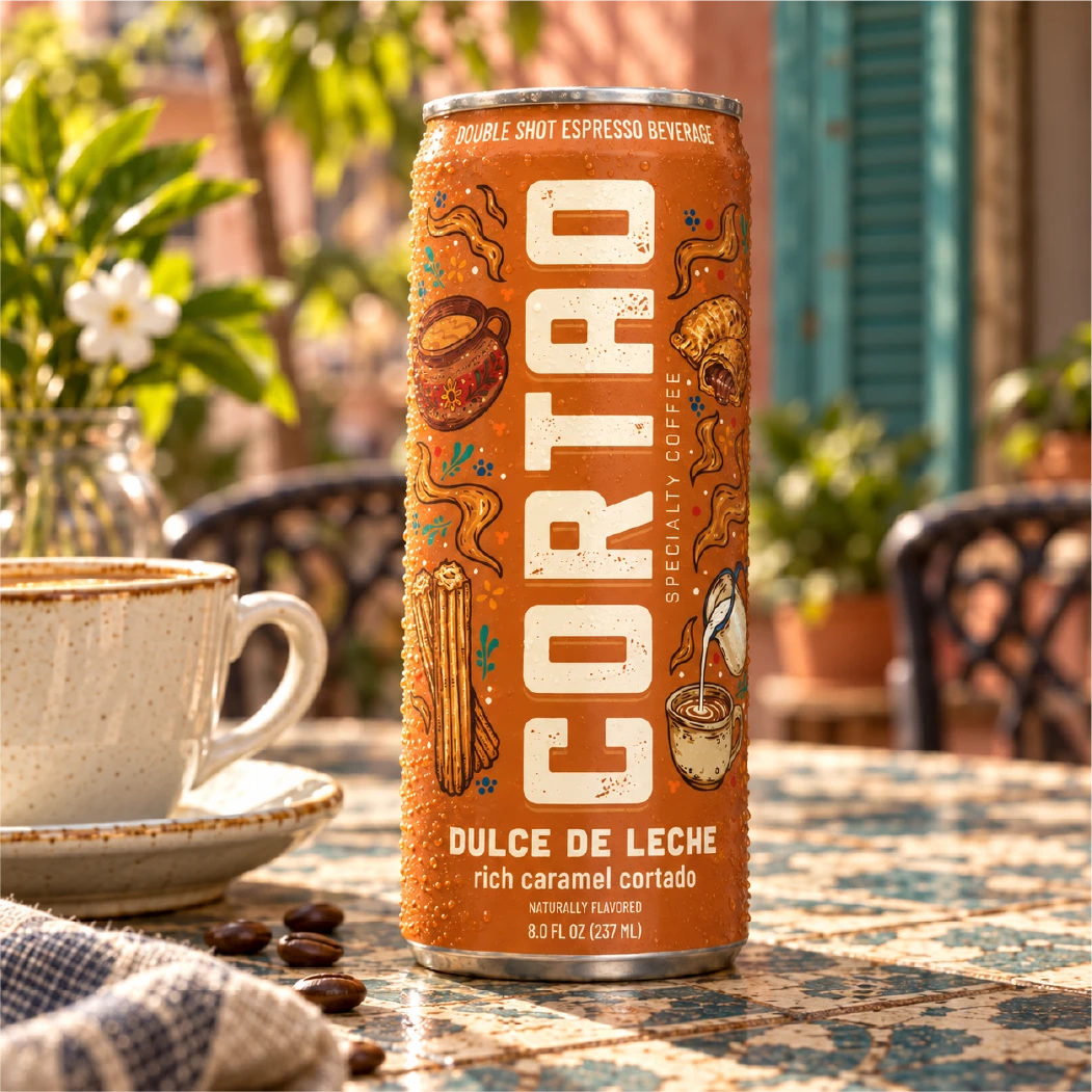
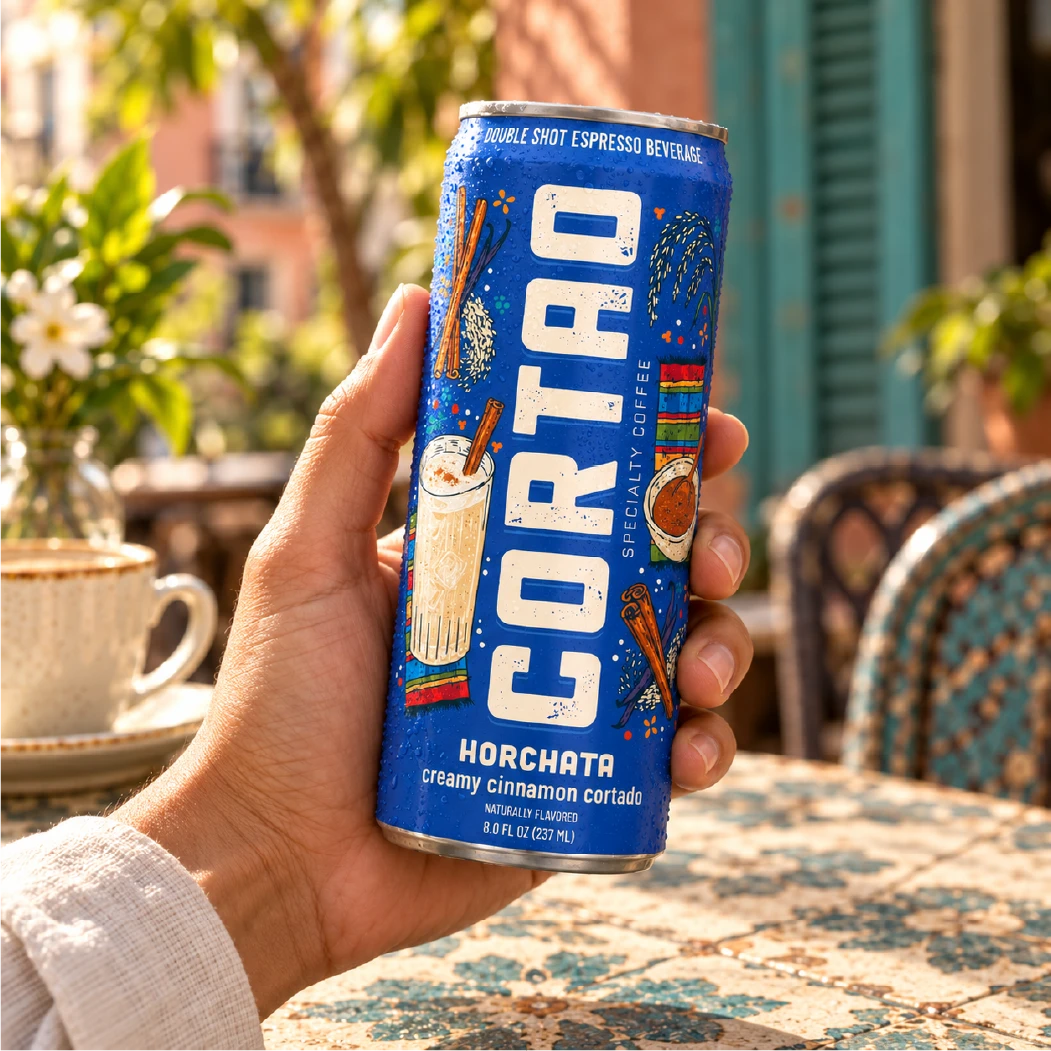
The Cortao world captures the warmth of a neighborhood café and the pleasure of an everyday coffee break. Sunlit courtyards, weathered tile, tropical greenery, and intimate product moments create an inviting visual language that connects the cans to the culture and rituals behind them.
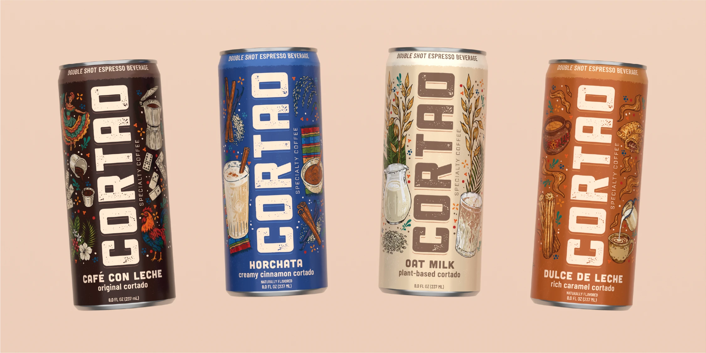
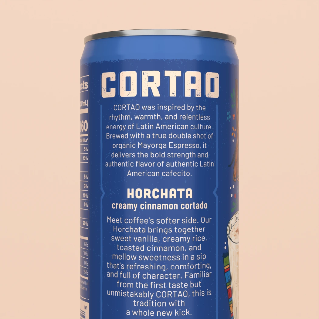
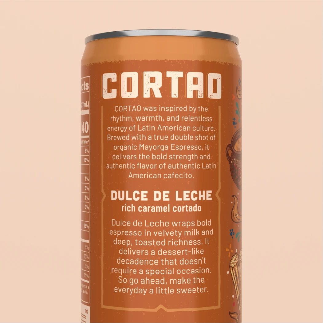
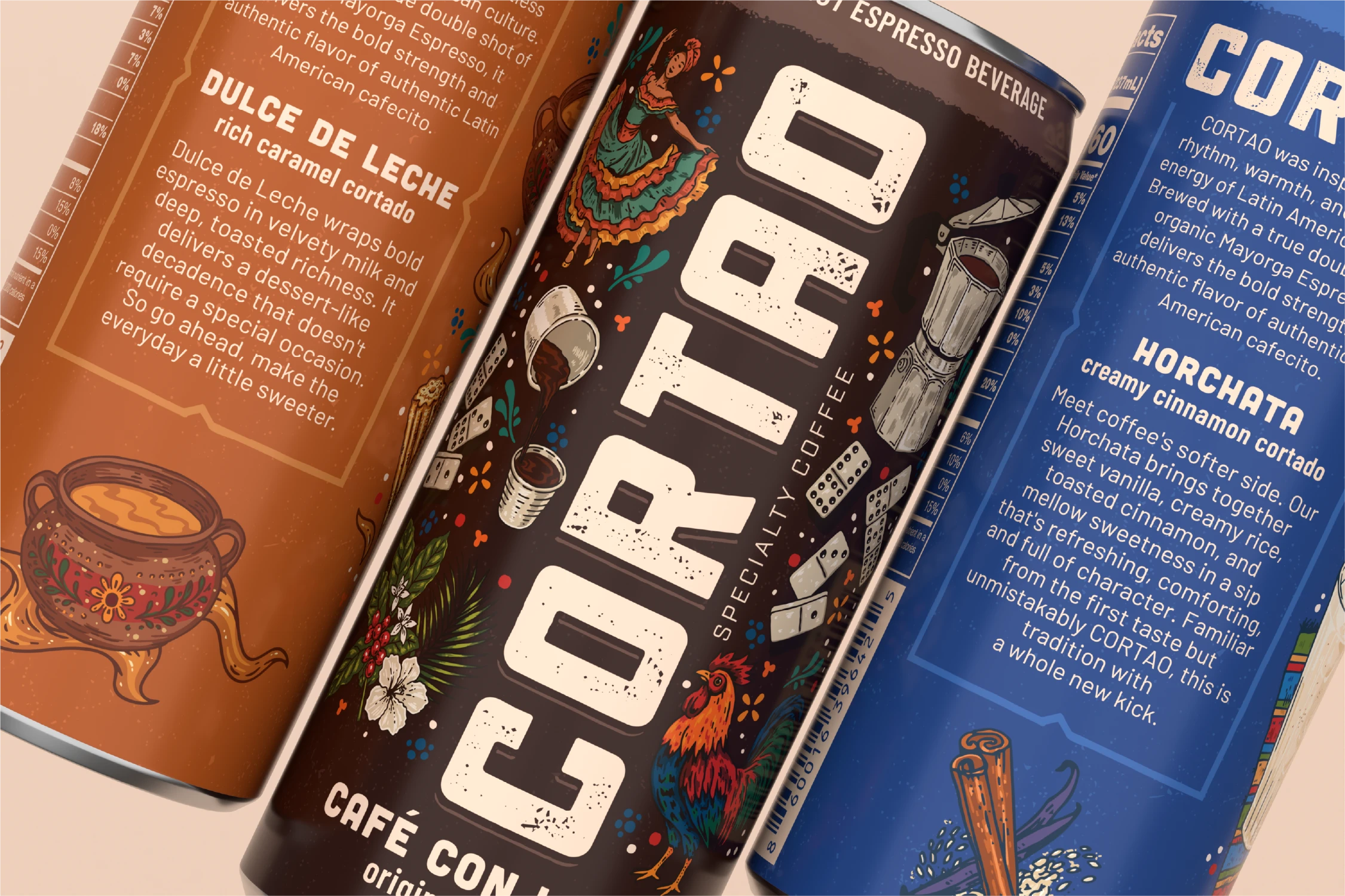
The packaging system balances bold recognition with rich storytelling across four flavors: Café con Leche, Horchata, Oat Milk, and Dulce de Leche. Oversized vertical branding anchors each can, while distinct color palettes and detailed illustrations express individual flavor personalities. Consistent placement of product descriptions and coffee callouts keeps the lineup cohesive and easy to navigate.
Cortao’s identity combines a bold, textured wordmark with expressive illustrations, decorative borders, and a warm coffee-and-cream foundation. Supporting badges, domino motifs, and the “Bold Coffee. Latin Soul.” tagline add personality beyond the can. Together, these elements create a flexible visual system that feels familiar, tactile, and unmistakably Cortao.
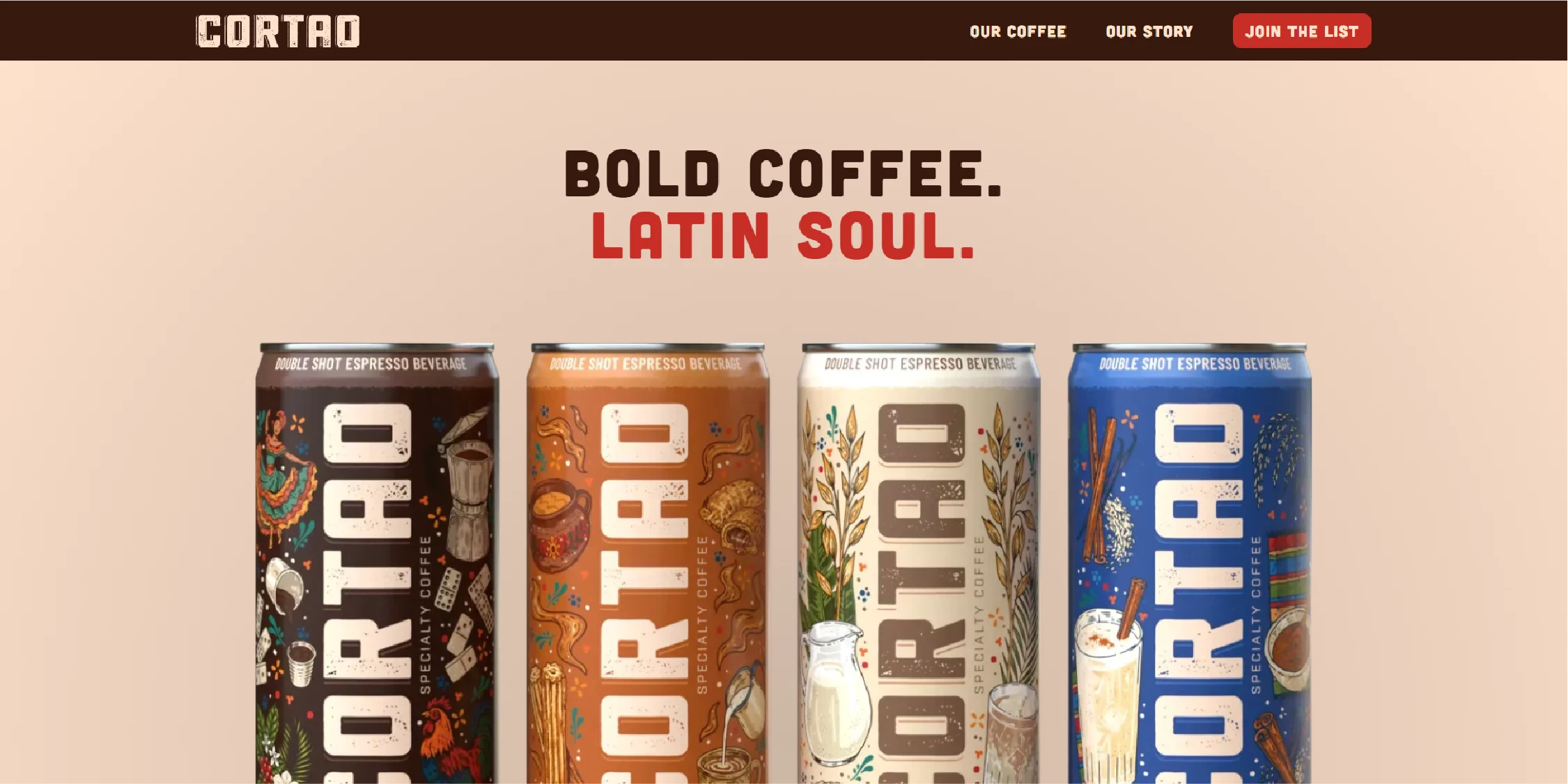
The website carries Cortao’s warmth into a digital experience centered on flavor discovery and brand storytelling. Cream backgrounds, espresso typography, red accents, and prominent can imagery connect the packaging to an inviting introduction to the brand and its coffee lineup.
Cortao emerged with a cohesive brand system that brings Latin American coffee culture to life across identity, packaging, and digital. Each flavor has its own visual story, connected through confident typography, rich illustration, and a shared sense of warmth. The result is a distinctive specialty coffee brand equipped to build recognition across new touchpoints while keeping its central promise clear: bold coffee, Latin soul.