Golden Days
Golden Days brings warmth and familiarity to the RTD vodka space through a clean, modern identity designed to feel approachable from the first interaction. The result pairs emotional storytelling with strong shelf presence across a growing flavor lineup.
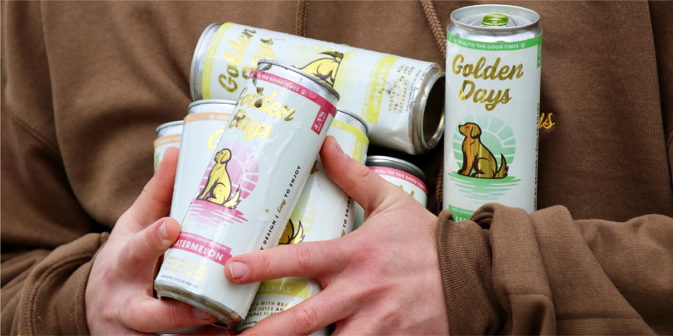
Inspired by the loyalty and spirit of dogs, Golden Days is a reminder to stay present, remain playful, and appreciate what is already around us. Rather than chasing trends, the brand celebrates the ordinary moments that become memorable when we take the time to notice them. Golden Days invites people to relax, enjoy good company, and recognize that even an everyday experience can feel golden.


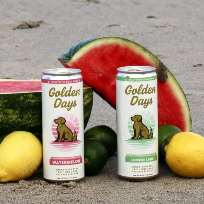
Golden Days is rooted in the feeling of an unhurried afternoon: good company, open air, and a reason to stay a little longer. Warm light, and easygoing moments extend the packaging into a lifestyle that feels optimistic, familiar, and genuinely lived in.
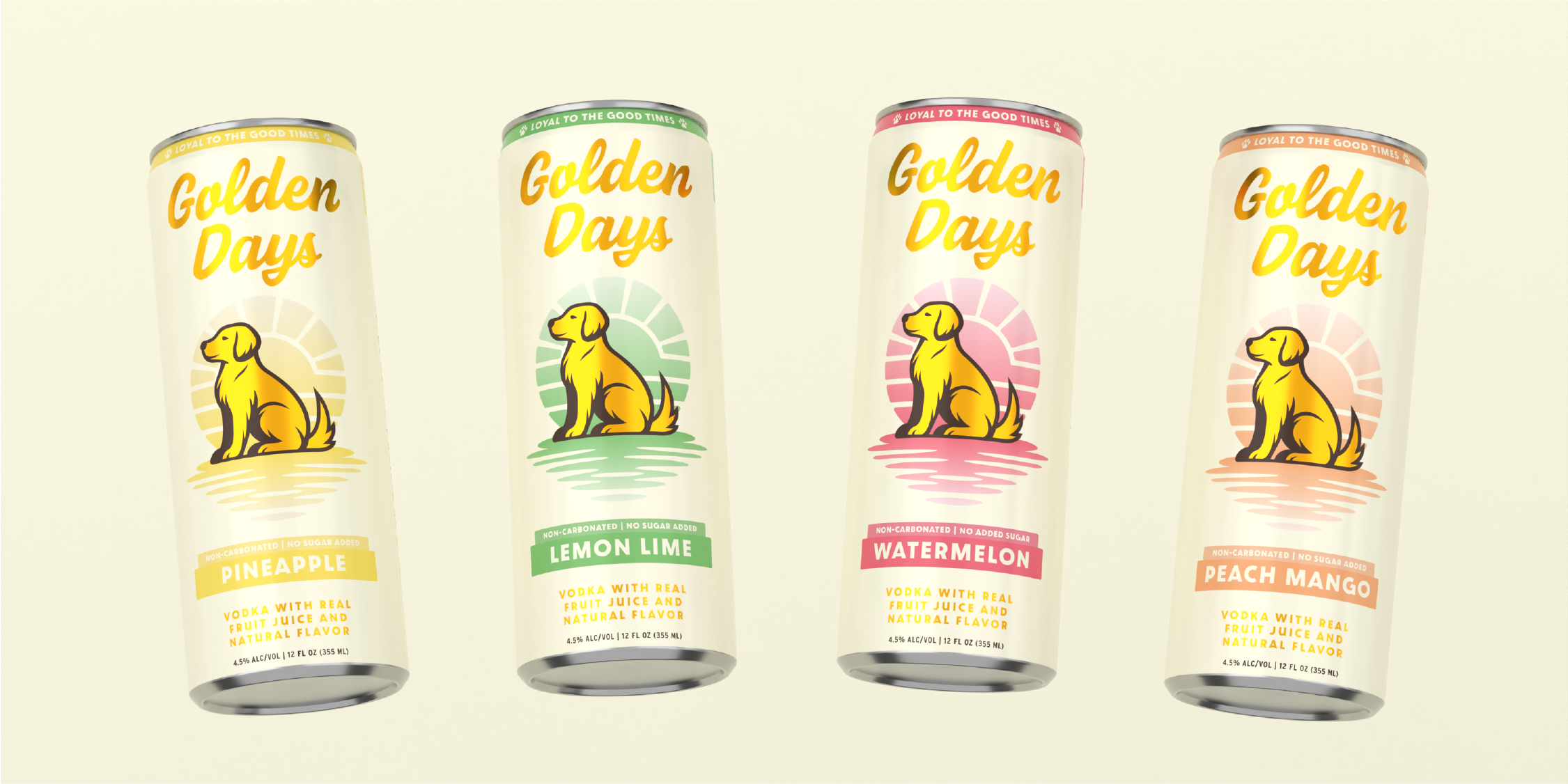
The packaging system uses a consistent neutral foundation, anchored by the dog icon and rising sun, while controlled flavor colorways distinguish each SKU. Clear hierarchy and repeatable design rules create immediate recognition while allowing the lineup to expand without losing cohesion.
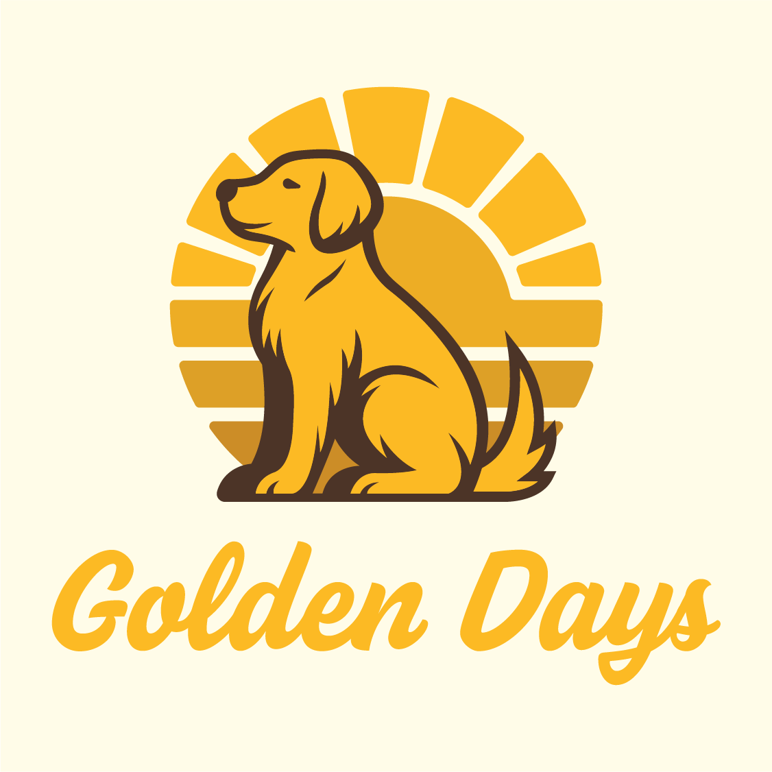

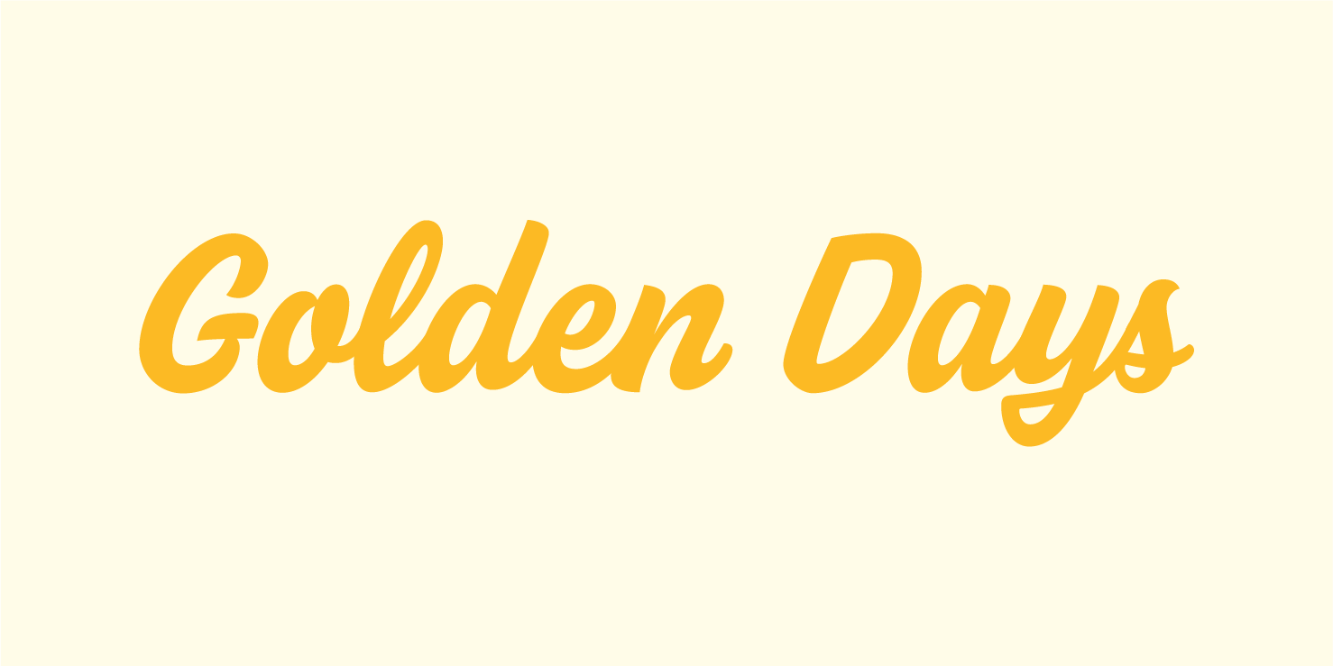

The identity is built from a compact set of flexible elements: a friendly wordmark, a distinctive dog icon, an optimistic sun motif, approachable typography, and a warm color system. Together, these assets create a recognizable visual language that can move naturally between packaging, digital content, and physical brand touchpoints.

Golden Days carries the same warmth and clarity beyond the can. Across retail, social media, merchandise, and launch materials, the identity remains simple, recognizable, and adaptable, allowing the brand to show up consistently without becoming repetitive.
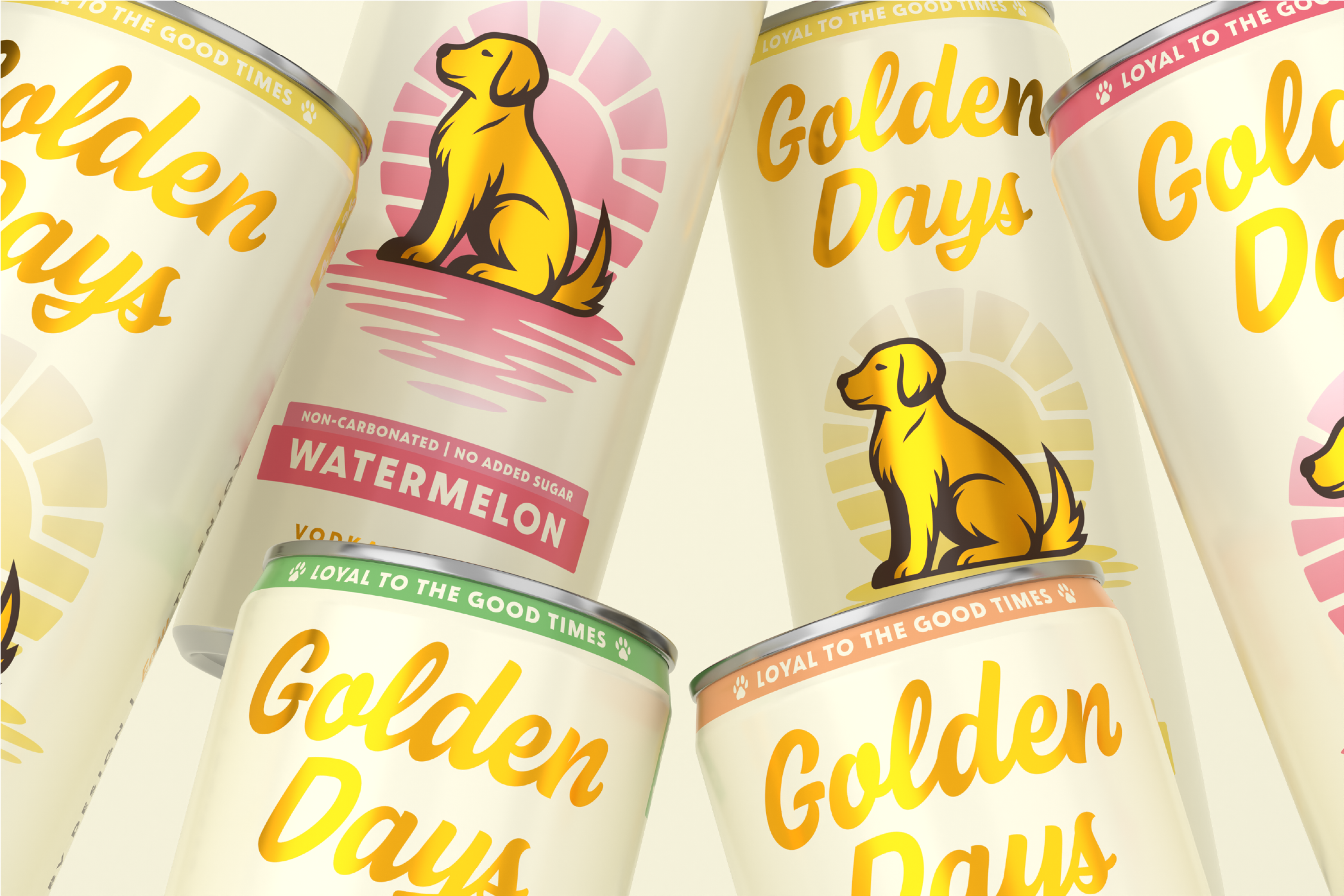
Golden Days emerged with a cohesive, shelf-ready identity that balances emotional warmth with retail clarity. The final system creates strong recognition across the lineup, supports future SKU growth, and gives the brand a clear platform for storytelling from shelf to social. By combining a memorable central icon with a restrained and scalable packaging structure, Golden Days delivers a brand experience that feels as inviting to hold as it does to share.