Cocktails For All the Feels

Brand Story & Vision
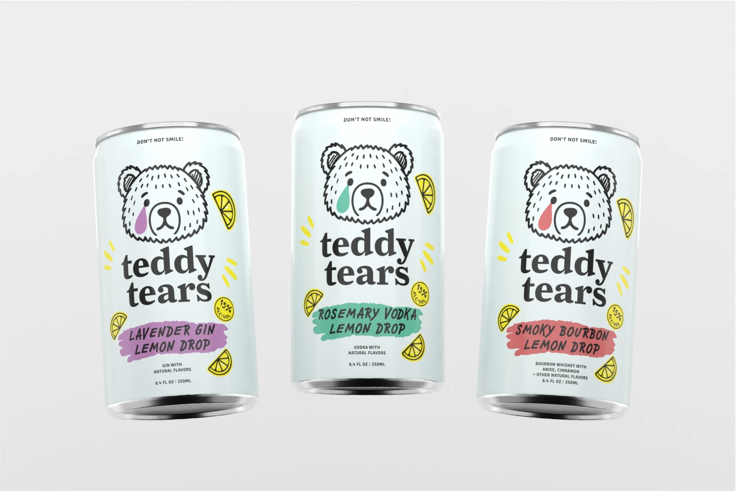
Teddy Tears was born from the idea that drinking should be both elevated and entertaining. The brand embraces the contradictions of life—sweet and bitter, playful and strong, silly and serious. With a sad-eyed teddy bear mascot and the ironic tagline “Don’t Not Smile,” Teddy Tears gives consumers permission to feel it all while enjoying a cocktail that’s as bold as their story. The vision: to become the go-to beverage for moments that are messy, memorable, and full of personality.
Our Creative Process
Our approach leaned into the humor and humanity of the brand. We developed a visual identity anchored in the illustrated teddy bear, using color-coded tears and flavor splashes to differentiate SKUs. Hand-drawn typography nods to imperfection while pairing with a bold, modern wordmark. Messaging was crafted to capture Teddy’s character: cheeky, raw, and relatable—like a friend who makes you laugh mid-breakdown. Every design choice amplified the brand’s storytelling potential, ensuring cans don’t just sit on shelves, but spark conversation.
Project Summary & Results
For Teddy Tears, we created a bold and playful identity that leans into humor while still delivering a clean, premium look. From the illustrated mascot to the cheeky tagline “Don’t Not Smile,” every element was designed to reflect the brand’s ironic personality and emotional storytelling. The can lineup uses color-coded tears and flavor splashes to distinguish each SKU, while maintaining a cohesive shelf presence that feels instantly recognizable. This approach positioned Teddy Tears as more than just a cocktail—it became a brand with character, built to spark conversation, drive consumer connection, and carve out a distinct space in the crowded ready-to-drink market.


Get Started with DigiMade Today!
Your beverage brand deserves an agency built entirely around your needs. Let’s turn your idea into something exceptional—together.